For years, there has been a heated debate about whether to use adaptive design or responsive design, and now it sounds like the debate is heating up again as we approach 2026 because of new devices, higher-resolution displays, more intelligent browsers and more impatient users.
It’s the same question over and over again: “Which type should I be using?”
For a long time, the safe response was usually something like, “Well… probably responsive.”
However, as SLINKY analyses the evolving landscape of SEO and user experience, it’s clear that things have shifted.
To stay competitive in 2026, the answer is no longer one-size-fits-all.
Some of these shifts were so subtle that you may have blinked too fast and missed them.
This post will outline the most important factors to consider when deciding which option to choose, including the messy stuff, the practical trade-offs, and the real-world examples that your competition is quietly taking advantage of.
Hopefully, by the end of this article, you will be able to make an informed decision regarding the best design choice for your online marketing initiatives without being bogged down in technical jargon.
Let’s dive in.
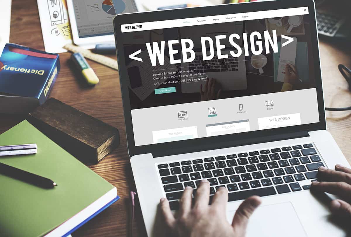
A Brief Recap (Without the Typical Textbook Tone)
Before moving forward, let’s first take a look at the differences between the two strategies in a way that everyone can understand.
Responsive design is similar to a stretchy t-shirt. It will adapt to the device, expanding, shrinking, bending and changing based on the screen size and shape.
There is one layout, with fluid grids and flexible elements, that will automatically adjust to the screen… sometimes very nicely, other times not so much, depending on how well it is built.
On the other hand, adaptive design is more like a closet full of different t-shirts.
Rather than stretching one version to accommodate every possible scenario, the website has multiple preset layouts, like a mobile version, a tablet version, a small laptop version and a huge monitor version that looks like it belongs to NASA.
The website will select the best version for the device.
Responsive = one design that adapts.
Adaptive = multiple designs selected behind the scenes.
Seems simple enough, correct?
However, when it comes to actual implementation, the differences affect everything from performance, user interaction, maintenance, SEO, accessibility and whether or not your website feels future-proof.
Why This Debate Matters Now More Than Ever in 2026
Factors like the following fuel the adaptive versus responsive design debate:
- Wearable and folding devices are becoming more popular.
- Large monitors are becoming the norm in the workplace.
- Browsers are smarter now and are able to predict people’s behaviour.
- Faster mobile networks have become readily available, but strangely, users now have shorter attention spans.
- AI-driven personalisation is being integrated into nearly all digital experiences.
Even cars now have large displays, and people are indeed browsing on them… even though they probably shouldn’t.
Today’s web design isn’t simply about adapting to mobile phones and desktops. It is about adapting to the range of screen shapes and user behaviours.
And this is where the “Which one reigns supreme?” question becomes messy, because each strategy excels in certain situations.
Responsive Design: Still a Favourite, But Not Without Flaws
Let’s be honest responsive design has dominated the conversation surrounding web builds for the last decade. Responsive design has some positive aspects:
1. Responsive design is generally simpler to implement
Most websites developed today default to responsive design because it’s easy to implement using frameworks such as Bootstrap and CSS Grid.
You develop your layout, add breakpoints, test your design on a couple of devices, and you’re done.
Responsive design does not require creating multiple versions of each page. So, it can easily integrate into most development workflows.
2. Responsive design acts predictably
There is a calming feeling when you’re viewing a page, and it slowly transforms as you shrink the browser window.
The fluidity allows users to transition between devices without having a drastically different interface.
And Google appreciates consistency. At least it used to.
3. Responsive design can handle weird screen sizes fairly well
Be it foldable phones, vertical monitors, or tablets with keyboards attached, responsive design can usually manage these oddities without falling apart.
Of course, responsive design is not without drawbacks.
Despite being the popular choice for a long time, responsive design has a number of recurring issues, especially for businesses that are heavily reliant on mobile conversions.
- It can be slow to load if the images, animations, or scripts don’t scale efficiently.
- Elements can occasionally resize in strange ways, which results in the mobile experience feeling “compressed.”
- You are constrained to a one-size-fits-all mentality, and that does not always align with how users interact with your website.
Users on a mobile device usually want something different from those on a desktop, not just a smaller version of the same thing.
As an example, a local service-based business may want prominent click-to-call buttons on mobile but would not likely want them on desktop.
Or a long scrolling home page that appears perfectly normal on a large screen can seem like a marathon on a phone.
At this point, adaptive design is looking a lot more appealing than it did before.
Adaptive Design: An Older Strategy, A New Interest
Adaptive design was previously considered too inflexible or too costly.
In 2026, it will receive a quiet resurgence, particularly among businesses seeking faster, more personalised, more conversion-oriented experiences.
Here is why.
1. Adaptive design loads faster sometimes significantly faster
Since the device receives a version that was created for it, you are not forcing a large desktop site to compress itself to fit onto a mobile device.
Mobile users receive mobile assets. Tablet users receive tablet assets.
Large-screen users receive layouts designed to showcase themselves on their massive screens.
This commonly translates to higher performance scores, which is a major obsession for almost all digital marketing teams today since speed affects search engine visibility, user satisfaction and conversion rates.
2. You can map user behaviour per device
Think about this for a moment.
A person viewing your website on a 27″ screen may be comparing products, reviewing case studies or researching early-stage information.
However, a person on a phone? They are typically attempting to:
- get directions,
- make contact,
- browse quickly, or
- perform a task with minimal friction
Adaptive design allows you to alter layouts and priorities in ways that responsive design cannot easily accomplish without the awkward rearrangement or stacking.
3. Building adaptive design is becoming easier than it used to be
The frameworks and tools have since improved, making adaptive design easier to build than before.
What’s more, developers have warmed up to device-specific versions of websites because performance demands are higher, user behaviour is more segmented, and brands want tighter creative control.
It’s no longer viewed as “increasing the work.” It’s “intelligent segmentation.”
However, like all strategies, adaptive design has some drawbacks:
- It requires additional planning before beginning.
- There will be more design output to maintain.
- Some individuals prefer fluid layouts for unusual screens.
And if your analytics indicate your audience utilises dozens of screen sizes, your team will need to determine how many versions of your site you wish to support.
Which One Will Help Businesses More in 2026?
For business owners, what produces better results?
Rather than providing a simple yes/no answer, here’s a breakdown by priority.
1. If speed is your highest priority, adaptive design typically produces faster times.
Mobile users have come to expect rapid loading, and they judge your site fast, often within the first second.
While responsive designs deliver everything, just reshaped but still with added weight, adaptive designs deliver only what is necessary for each device type.
In many cases, some sites lose 1-2 seconds of loading time when changing from responsive to adaptive formats.
2. If the conversions are more important than looks, adaptive design may offer a better strategic fit.
You can create device-specific conversion points, including:
- Call buttons on mobile devices
- Side-by-side price comparisons on desktops
- “Book Now” widgets that are displayed more prominently on tablet devices
- Chat features that only display on devices that do not irritate users
Adaptive design provides a way to prioritise targeted design elements in a way that responsive design does not allow, without creating a mess.
3. If you are concerned with efficiency, then responsive design is the safer bet.
When choosing a responsive design, you have:
- Only one design to work with
- Only one code base
- Less variation in design
- Faster development times
Overall, it is clean and easy to maintain and is suitable for smaller websites/businesses that do not have too much complexity in their objectives.
4. If your brand requires high levels of visual consistency, responsive design performs slightly better.
If you want your website to look nearly identically on every possible device, responsive design is more suitable to meet this requirement.
5. If you desire long-term flexibility, it’s a mixed bag.
Although responsive design appears more future-proof due to its ability to stretch naturally, as more devices arrive with specific user behaviours, adaptive design offers customised experiences that appear more thought-out.
Therefore, it is not necessarily that one method is “future-proof” and the other is not. Rather, each handles the future differently.
An Honest Breakdown
Businesses that transition to adaptive design typically need:
- stronger mobile results,
- faster conversion paths,
- device-specific messaging,
- analytics-based decision-making, and/or
- greater control over each device experience.
Businesses that stick with responsive design typically need:
- lower build costs and maintenance,
- simplified workflows,
- A consistent look across devices, and/or
- something reliable & predictable.
Both options are equally viable based on your goals.
What Google Wants (Because That Still Matters)
Google has always been supportive of responsive design as the preferred option. However, in recent years, speed has become more important than design style.
Adaptive design sites consistently outperform responsive design sites in terms of mobile speed.
Google does not penalise adaptive design. What it does is penalise slow design.
That distinction is significant.
As Core Web Vitals continue to get tighter, sites that use adaptive layouts have an advantage over responsive designs because they send lighter assets to smaller devices.
Although Google still publicly supports responsive design, the actual results favour whichever design approach provides:
- fastest rendering times,
- cleaner layouts, and
- better interaction signals.
This has caused more brands to begin exploring adaptive design frameworks.
So… Which One Will Rule the Web in 2026?
If you are looking for a dramatic, clickbait-style “There Can Only Be One!” answer, sorry to disappoint. This debate is far from over and both approaches still have a role in modern digital marketing.
However, here is the straightforward and human answer:
Responsive design still dominates in terms of popularity.
Adaptive design dominates in terms of performance and personalisation.
Popularity does not necessarily equate to superiority. It simply indicates that people are familiar with it.
Performance and personalisation are increasingly driving digital behaviour, and adaptive design fits that bill better, especially on mobile.
If you need stronger mobile conversions, faster loading speeds, or device-specific interactions, adaptive design is certainly worth exploring.
If you want a more streamlined, cost-effective, consistent build process, responsive design is still a safe bet.
Final Thoughts
The best solution is not about which methodology is the “winner.”
It is about which one enables your users to accomplish what they were trying to do, rapidly, comfortably, and without obstacles.
If you select either adaptive or responsive design solely based on current trends, you will likely end up disappointed.
However, if you select based on your users’ behaviour, your objectives, and your overall digital strategy, the correct choice becomes more apparent (and typically more financially rewarding).
And if this still seems somewhat unclear, that is acceptable. Even experienced marketers occasionally get stuck in a loop regarding this topic.
But the good news? You don’t have to commit blindly!
Start with your analytics. Check your device distribution. Review your conversion paths. And do not be afraid to question the “default.”
The best performing websites in 2026 are not just visually stunning; they make smart decisions based on how real people browse.